

Typography & Printshops
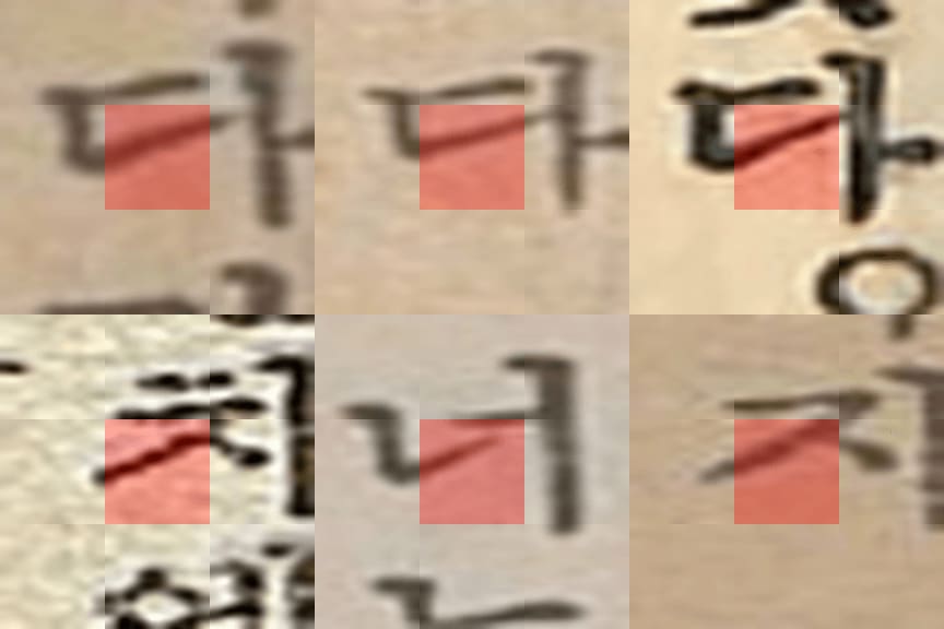
The first case study reads the typographic output of four printing houses in colonial Seoul: Sinmungwan, Taedong Inswaeso, Hansŏng Tosŏ, and Chosŏn Inswae. All four bought matrices from the same Japanese foundries and set to the same point sizes, so their pages converge on a narrow shared vocabulary of forms. I treat that convergence as a method rather than an obstacle. Against so uniform a background, the minute ways a shop weights a stroke or finishes a serif become more legible rather than less, the tension the chapter calls the standardisation paradox.
To recover those traces across roughly 57,000 page images, I train a multiple-instance-learning model whose attention scores are the classification itself, so we can identify which patches of a page the model relies on. What surfaces is differentiation through density rather than distinct fingerprints: the four shops share one typographic space, and each concentrates in different parts of it, as in the rendering of the iŭng (ㅇ) or the heavy initial serifs that mark Hansŏng Tosŏ. These signatures track the printer that set the page, not the publisher that commissioned it.